


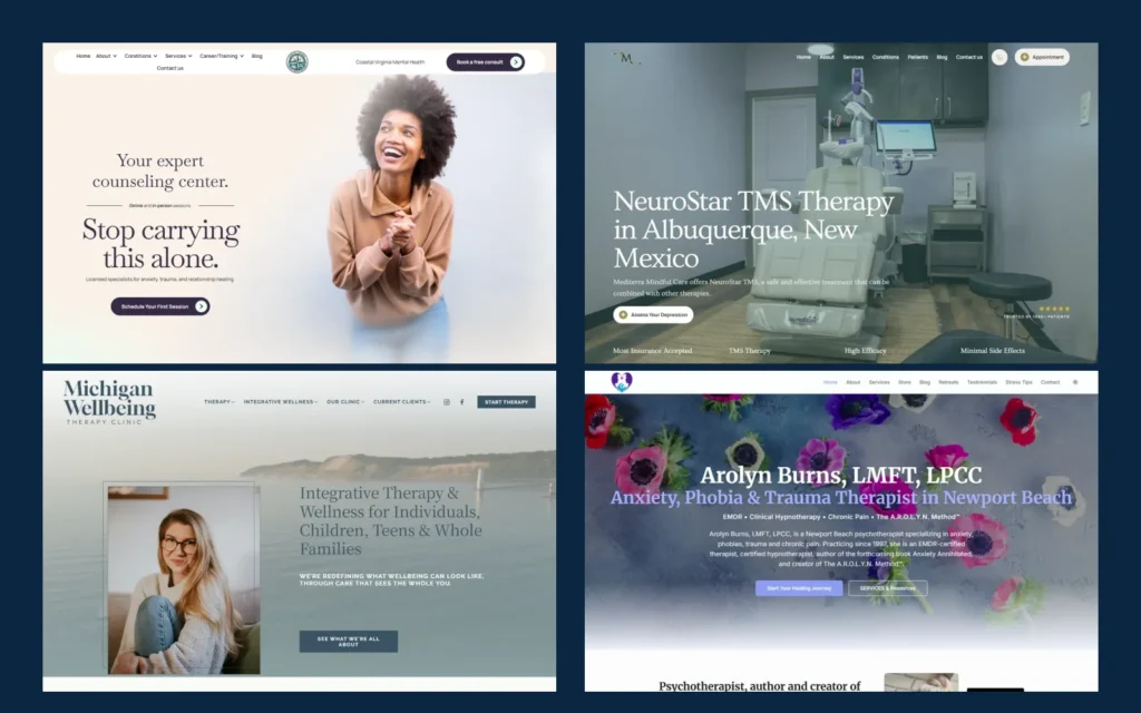
A therapist website can look professional and still produce very few inquiries.
Potential clients are not visiting simply to admire the colors, photography, or logo. They want to know whether the practice helps people like them, whether appointments are available in their area, and what they should do next.
The best therapist websites answer those questions without making visitors search for the information. They create trust, explain the service clearly, and make reaching out feel like a reasonable next step.
The examples below come from therapy and mental health practices J Curve Advertising has supported through website design, landing pages, SEO, content, advertising, or conversion improvements. Some are counseling practices, while others provide psychiatry, TMS, or broader mental health services.
A public website cannot reveal its actual conversion rate. The observations below focus on features that reduce confusion, establish relevance, and make it easier for a suitable prospective client to contact the practice.
What Makes a Good Therapist Website?
A strong therapist website should quickly answer five questions:
- Who does the practice help?
- What services does it provide?
- Where are appointments available?
- Why should someone trust the practice?
- What should the visitor do next?
It does not need to explain every modality on the homepage. It needs to help the right person recognize that the practice may be a good fit.
Website Example 1: Coastal Virginia Mental Health
Website: coastalvamentalhealth.com
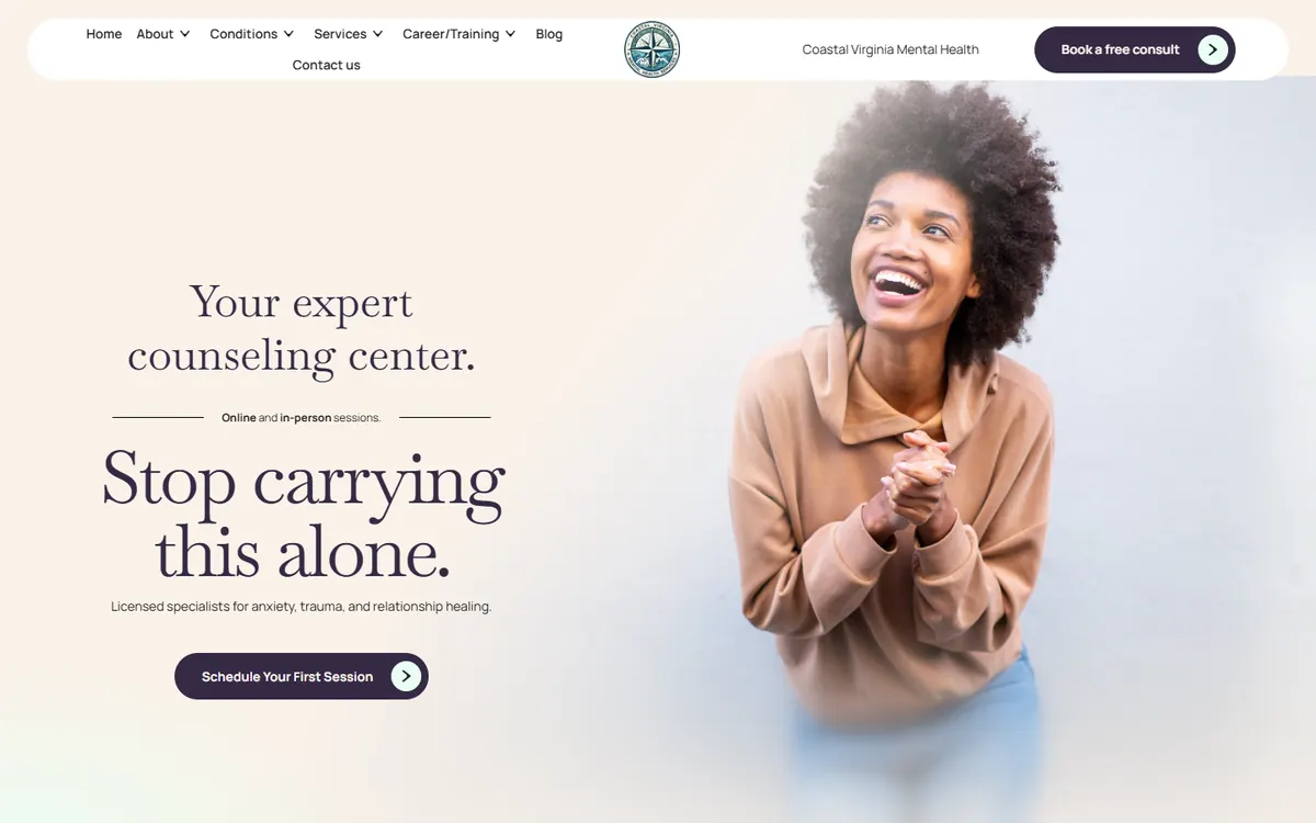
Coastal Virginia Mental Health is a strong example of a professional website that still feels welcoming. The homepage introduces the practice clearly, while separate pages help visitors explore the conditions treated and learn more about the team.
The site avoids making the visitor interpret an overly clever headline or a long list of clinical terminology. People can understand what the practice offers, who provides the care, and how to take the next step.
That simplicity is important in mental health. Someone looking for support may already feel overwhelmed. The website should make the process feel clearer, not add another layer of uncertainty.
Why it works: The design creates a professional first impression while keeping the services and contact path easy to understand.
What to borrow: Build the navigation around the decisions a prospective client actually needs to make.
Case study
Want to see what a good website can actually produce? After we redesigned Coastal Virginia Mental Health’s website and paired it with Google Ads and SEO, the practice went from relying on word of mouth to 206 new client leads in six months.
Website Example 2: True Life Change
Website: truelifechange-maryland.com
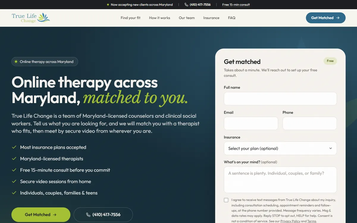
True Life Change is a strong example of a group practice website built around one clear action: getting matched with the right therapist.
The homepage states the offer immediately: online therapy across Maryland, matched to you. A short “Get matched” form sits right beside the headline and asks only for a name, email, phone number and optional insurance plan, so someone can reach out in about a minute without having to choose a therapist first.
A “Find your fit” section gives visitors dedicated pages for the kind of support they are looking for, including Black therapists, LGBTQ+ affirming therapy, male therapists, couples therapy, and OCD therapy. Every page leads to the same team and the same free 15-minute consult.
A four-step explanation of how it works, therapist cards showing credentials, specialties, and who each clinician sees, and a clear insurance section answer the most common questions before someone picks up the phone.
Why it works: Every section supports one next step, and the matching process removes the hardest decision for a new client.
What to borrow: If your practice has several therapists, let people ask to be matched instead of making them choose a clinician on their own.
Website Example 3: Connecticut Integrative Counseling
Website: ctintegrativecounseling.com
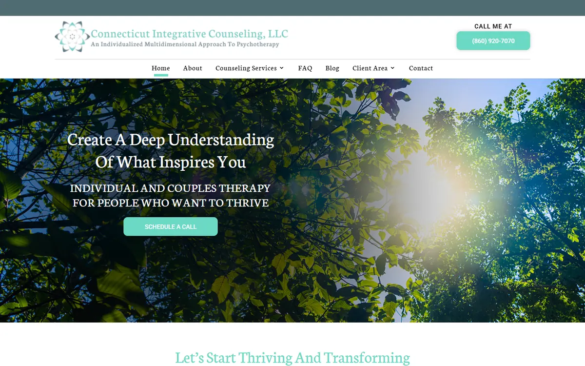
Connecticut Integrative Counseling demonstrates how a therapist can present an individualized, humanistic approach without filling the website with clinical language.
The site introduces Suzi Sena’s perspective and explains what an integrative approach may mean for the person seeking therapy. It also addresses private-pay care in terms of privacy, choice, and flexibility rather than presenting out-of-network status as something negative.
This is particularly valuable for a private-pay practice. Potential clients need to understand why the experience may be different before they can decide whether the investment makes sense for them.
Why it works: The website connects the therapist’s approach with benefits a prospective client can understand.
What to borrow: If the practice is private pay, explain the value of the service instead of only displaying a fee.
Website Example 4: Mediterra Mindful Care
Website: mindfulcarenm.com
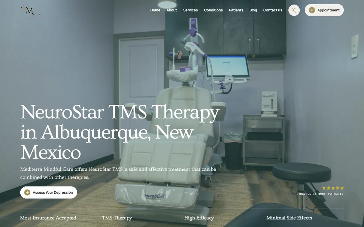
Mediterra Mindful Care gives NeuroStar TMS a central position instead of treating it as one small service in a long list.
Dedicated pages cover TMS in Albuquerque, treatment-resistant depression, depression treatment, and care for military members. This lets visitors enter through the topic most relevant to them while keeping the primary next step focused on scheduling a consultation.
The website also balances medical technology with a calm, reassuring identity. That matters because TMS can sound unfamiliar or intimidating to someone encountering it for the first time.
Why it works: The practice’s priority treatment has enough space to be understood and supported by related content.
What to borrow: If the practice wants to grow a particular service, build a complete group of pages around it.
Website Example 5: Room for Change
Website: roomforchange.info
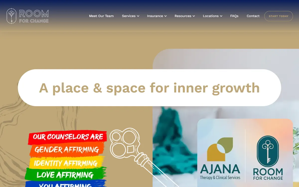
Room for Change shows how a large counseling practice can make a broad range of services, therapists, and locations easier to navigate.
The website clearly identifies its offices in Garland, Dallas, and Houston, along with virtual therapy throughout Texas. Visitors can explore individual, couples, family, teen, trauma, LGBTQ+, postpartum, and Spanish-language therapy without having to determine which clinical term applies to them first.
The therapist directory goes beyond names and credentials. It includes specialties, locations, appointment formats, and availability, while client care coordinators help people find the right counselor. Practical information about insurance and session rates also reduces uncertainty before someone reaches out.
Why it works: The website makes a large practice feel easier to navigate by combining location pages, detailed therapist profiles, clear services, and matching support.
What to borrow: If the practice has many therapists, do not expect visitors to choose alone. Provide filters, useful profiles, or a matching process.
Website Example 6: Collaborate Counseling
Website: collaboratecounseling.com
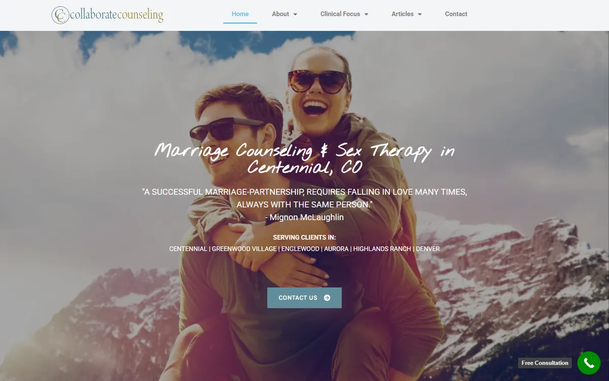
Collaborate Counseling demonstrates how focused service pages and consistent content can help a specialized practice attract people searching for specific support.
The website contains pages for infidelity, intimacy, depression, relationships, and sex therapy. Someone searching for help after infidelity can arrive on a page that addresses that situation instead of being directed to a generic counseling page.
The blog expands on closely related relationship and mental health questions. This creates more opportunities to be discovered while allowing prospective clients to understand the therapist’s perspective before making contact.
Why it works: Each important concern has a relevant entry point from Google to the website.
What to borrow: Build a useful page for every priority service, then support it with closely related articles.
Website Example 7: Shiloh Health
Website: myshilohhealth.com
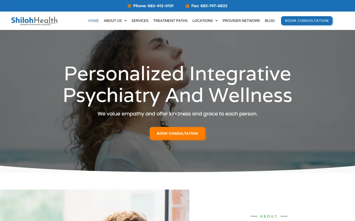
Shiloh Health uses location and condition-specific pages to connect prospective patients with relevant psychiatric care.
The Fort Worth content makes the office location, telehealth availability, new-patient status, and appointment route easy to identify. Individual pages address anxiety, ADHD, bipolar evaluations, psychiatric evaluations, and other priority services.
Instead of sending everyone to one broad psychiatry page, the website can match the specific concern that brought the person to Google. The practice is also differentiated through its integrative approach to medication, therapy, lifestyle, and whole-person care.
Why it works: The search term, location, service, and next step remain closely aligned.
What to borrow: Create focused pages for the most important combinations of service and location.
Website Example 8: Vigor Health Services
Website: vigormentalhealth.com
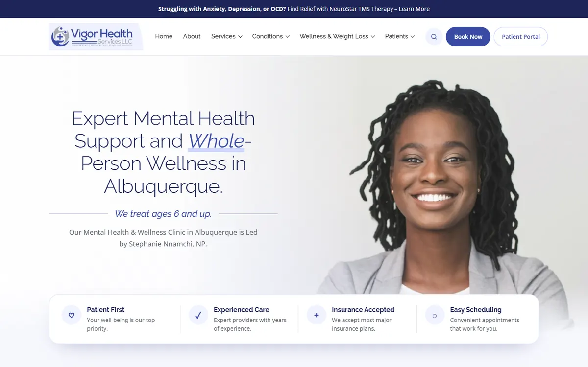
Vigor Health Services combines mental health and broader wellness services within one practice. The website separates evaluations, condition-specific mental health care, new-patient information, and wellness offerings so visitors can follow the path relevant to them.
Its new-patient page explains appointments, forms, insurance, payment, and preparation. Condition pages provide more focused routes for people searching for services such as anxiety treatment in Albuquerque.
The practice location, phone number, and appointment request remain visible, which is particularly important for mobile visitors ready to contact the office.
Why it works: A broad service mix is divided into manageable paths with clear contact options.
What to borrow: When mental health and wellness services share one website, keep the categories clearly separated.
Website Example 9: Michigan Wellbeing Therapy Clinic
Website: miwellbeing.org
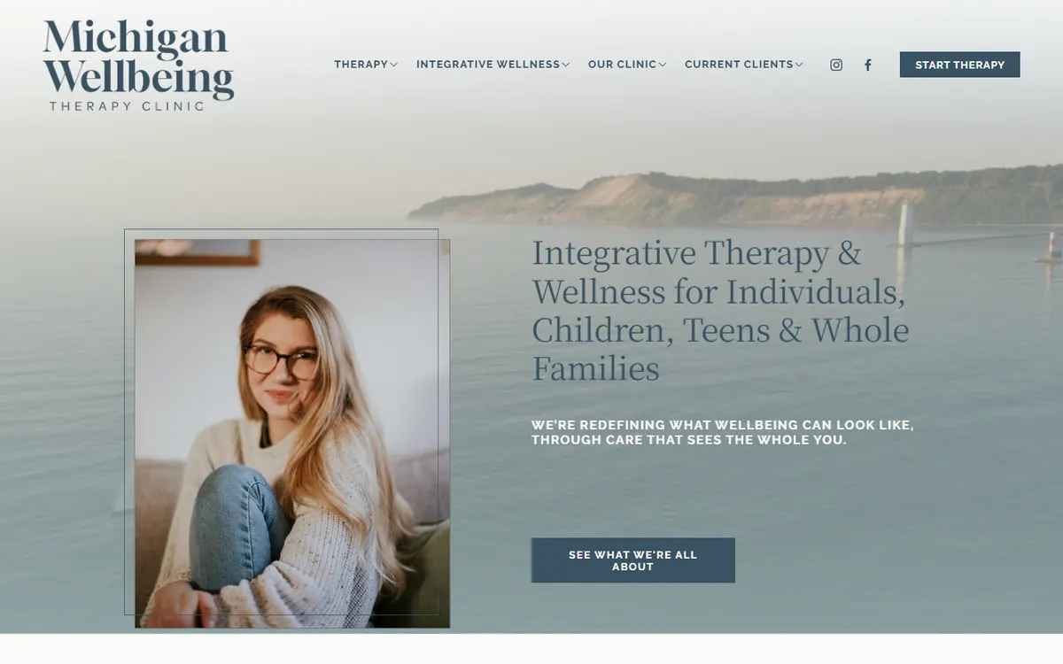
Michigan Wellbeing Therapy Clinic is a good example of how a simple design can make a therapy website feel more approachable. The pages use clean layouts, restrained colors, generous spacing, and clear headings rather than filling the screen with too many effects or competing sections.
That simplicity keeps attention on the information prospective clients actually need. The site clearly states that therapy is virtual throughout Michigan, identifies the populations served and major accepted insurance plans, and provides individual therapist pages for the clinical team.
A dedicated getting-started page covers matching, virtual sessions, fees, insurance, and the inquiry process without making the visitor move through an elaborate design.
Why it works: The simple visual design makes a broad range of information feel manageable and keeps the next step easy to find.
What to borrow: A therapist website does not need complicated animation or unusual layouts. Strong spacing, readable text, and clear sections are often more effective.
Website Example 10: Koren Bedeau, PhD
Website: drkobedeau.com
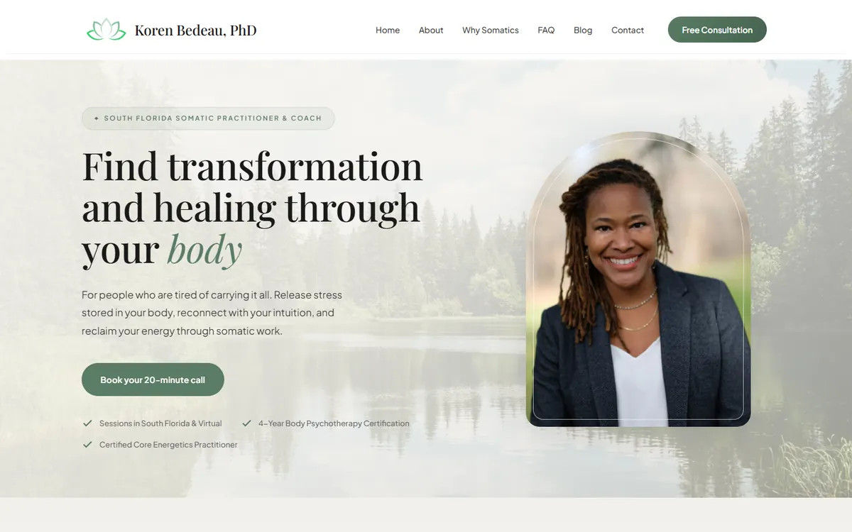
Koren Bedeau’s website is a good example of a personal brand built around somatic work. Rather than presenting the service as conventional talk therapy with a different label, the website creates a grounded visual and written experience that reflects the nature of the work.
The design gives Dr. Bedeau room to explain her perspective while keeping the path to connecting with her visible. This is important for modalities that prospective clients may not fully understand when they first arrive.
Why it works: The visual identity and content support the experience the practitioner is offering.
What to borrow: If the modality is unfamiliar, use the design and copy together to help visitors understand how the work may feel.
Website Example 11: Life Source Affordable Counseling
Website: affordablecounselingservices.org
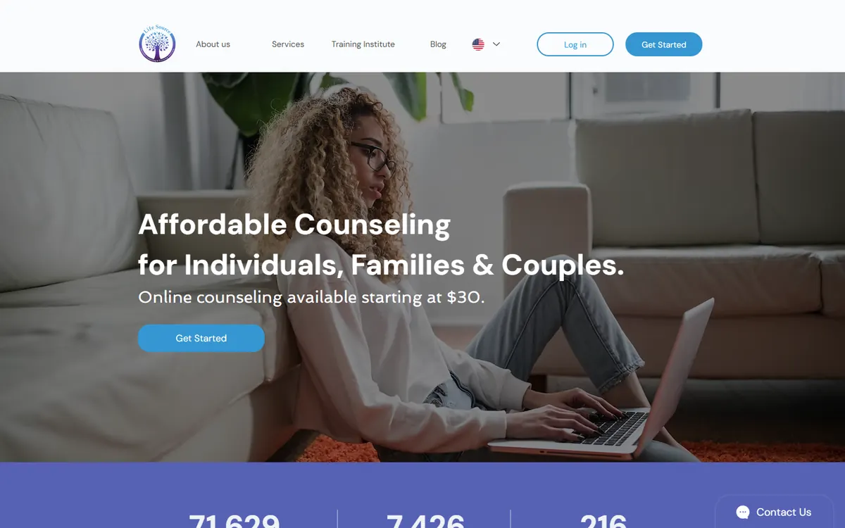
Life Source Affordable Counseling serves people who may be comparing several services while also worrying about cost and accessibility.
The website makes a broad range of counseling options easier to explore and presents affordability as part of the practice’s identity. This gives visitors an immediate reason to continue reading rather than assuming that therapy will be outside their budget.
For an organization offering several services, simple structure matters more than elaborate design. People need to find the appropriate program and understand what to do next.
Why it works: The core value of accessible counseling is visible throughout the website.
What to borrow: If affordability or access is a major differentiator, make it central to the message instead of burying it in a FAQ.
Website Example 12: Philip Meeker Somatics
Website: philipmeekersomatics.com
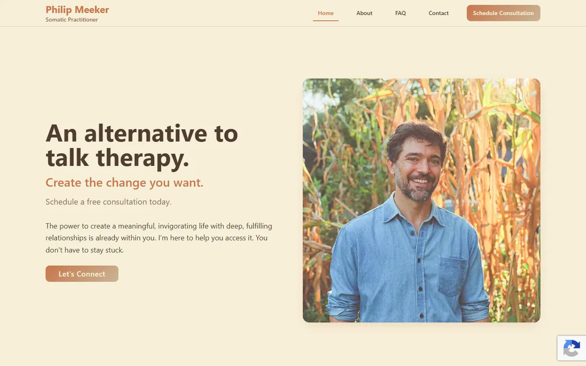
Philip Meeker Somatics uses an immersive, personal design to introduce work that may be difficult to describe through a standard list of services.
The site relies on thoughtful imagery, spacious layouts, and human-centered writing to communicate the tone of the practice. It provides context for somatic work without turning the homepage into a long educational article.
This approach is appropriate for a personal practice where the relationship with the practitioner is a major part of the decision.
Why it works: The site creates a clear feeling while still helping visitors understand the practitioner and the next step.
What to borrow: Use imagery and spacing intentionally when the experience of the work is central to the service.
Website Example 13: Arolyn Burns
Website: arolynburns.com
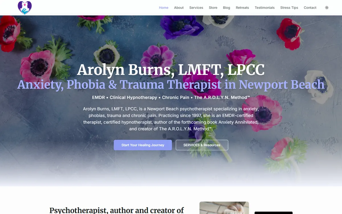
Arolyn Burns’s website brings together therapy, EMDR, hypnotherapy, speaking, writing, professional resources, and a forthcoming book within one personal brand.
The homepage leads with her location, credentials, priority specialties, and experience. Separate pages provide focused information about trauma, phobias, performance anxiety, and other areas of care.
Her media appearances, awards, book, and educational work strengthen credibility without replacing the core therapy message.
Why it works: Several professional roles are organized around a recognizable expertise in anxiety, phobias, trauma, and chronic pain.
What to borrow: If a therapist is also an author, speaker, or educator, connect those roles through one clear specialty.
Website Example 14: Coral Mountain Behavioral Health
Website: coralmountainhealth.com
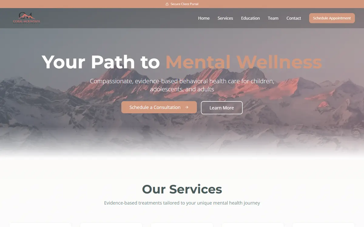
Coral Mountain Behavioral Health offers therapy, psychiatry, TMS, Spravato, and ketamine treatment for children, adolescents, and adults.
The homepage separates these services into clear paths and introduces the providers, accepted insurance plans, office location, and consultation option. Dedicated treatment pages explain what each advanced service involves and who may be eligible.
This structure is important for a practice where different visitors may need very different forms of care.
Why it works: Complex behavioral health services are organized around clear treatment choices and practical information.
What to borrow: Give advanced treatments their own landing pages, eligibility information, and focused calls to action.
What the Best Therapist Websites Have in Common
The strongest elements across these websites are strategic, not merely decorative.
They make the audience recognizable
Strong websites describe real concerns, populations, and situations. They do not force prospective clients to translate a list of modalities.
They make practical information visible
Location, telehealth availability, fees, insurance, and provider availability often determine whether someone can use the service.
They create pages for priority services
A short list of every condition is rarely enough. Dedicated pages let the practice speak directly to each person’s concern and create more opportunities to appear in search.
They provide a specific next step
Effective calls to action tell the visitor what will happen:
- Schedule a consultation
- Request an appointment
- Find a therapist
- Verify insurance coverage
- Check availability
They make the people behind the practice visible
Potential clients are choosing a therapist or provider, not only a service. Clear photographs and useful biographies can establish trust before the initial conversation.
Therapist Website Conversion Checklist
- Can visitors identify who you help within a few seconds?
- Is your location or telehealth service area easy to find?
- Does the homepage provide one obvious next step?
- Does every priority service have its own page?
- Are fees or insurance arrangements explained accurately?
- Can visitors tell whether you are accepting new clients?
- Do provider biographies explain client fit, not only credentials?
- Is the phone number clickable on mobile?
- Is the inquiry form short and easy to complete?
- Does the confirmation page explain what happens next?
- Does the website work properly on a phone?
- Is the language understandable to someone unfamiliar with therapy?
If several answers are no, the website may be losing prospective clients even if it looks professional. Our private practice marketing plan template can help you decide which fixes to tackle first.
A Good Therapist Website Should Make Reaching Out Feel Easier
The best therapist website is not necessarily the one with the most elaborate design. It is the one that helps the right person feel understood, confirms that the service may fit what they need, and gives them a clear way to begin.
Good design supports that process. Clear writing, focused service pages, transparent information, and a simple inquiry path turn the design into a useful marketing asset. For more ways to attract the clients you want, see Marketing Ideas for Therapists: 7 Ways to Get More Private-Pay Clients.
If your website looks polished but is not producing enough consultations, the problem may not be traffic alone. The message, structure, or next step may be creating unnecessary friction.
J Curve Advertising designs and improves websites for therapists and mental health practices. Schedule a free strategy session to discuss what may be preventing your website from turning more visitors into inquiries.